People do not file a ticket when your product is confusing. They just stop.
Every product has a step where a meaningful share of people give up, and almost nobody tells you which one it is. They do not complain, they do not raise a support case, they simply do not come back, or in an internal tool they build a spreadsheet alongside your software and quietly work in that instead. Good UX and UI design is the discipline of finding that step and removing the reason people stop at it, in customer products and internal tools alike.
Illustrative: the shape of a typical onboarding funnel. The wide part is not the problem. The place it narrows is.
5users per round of testing
AAWCAG 2.2 as a design constraint
800+Projects delivered
7+Years delivering
The cost
What bad design actually costs you.
Not aesthetics. These are four costs of poor design, and every one of them shows up on a finance report somewhere before it shows up in a design review.
Support load per hundred users
Support absorbs the confusion
Every unclear screen becomes a call. Teams often accept this as a fixed cost of the product, when many of those tickets trace back to a handful of screens that could be fixed quickly.
Trial to paid conversion
Sales demos work, trials do not
A guided demo hides everything a person has to work out alone. When conversion from trial is far below what the demo suggests, the gap is usually the first ten minutes of unaccompanied use.
Shadow spreadsheets in circulation
People route around the tool
Internal software that is slower than a spreadsheet loses to the spreadsheet. The data then lives outside the system, and the reporting you built the system for stops being true.
Onboarding hours per new user
Training substitutes for clarity
A two day training course is sometimes necessary and often a way of paying, forever, for a structure that could have been made obvious once.
Discovery
Design work that starts with evidence.
Most design engagements start with a proposal for months of screens. We start by producing evidence, because the decisions worth arguing about are usually settled by watching five people attempt the thing.
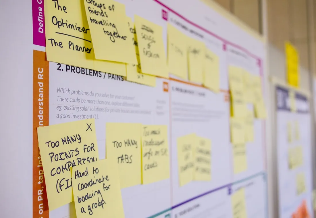
Day three is for mapping. Every note on the wall should come from watching somebody try to use the product, not from opinion.
Stage one
Understand the business
What the product is for, who is failing to use it and what the commercial consequence is. We read the support tickets and the analytics before we form an opinion.
Stage two
Watch people work
Sessions with real users doing real tasks. Not focus groups and not opinions about a design, but observation of what people actually do when nobody is helping them.
Stage three
Map and prioritise
The journey as it exists, with the failure points marked and ranked by how many people they affect and what it would cost to fix each.
Stage four
Design the critical path
Interface work on the one flow that matters most, built as a prototype people can click rather than a picture of a screen.
Stage five
Test and hand over
The prototype back in front of users, then a written plan with what we learned, what we would build first, and what we would not build at all.
Every UX and UI engagement is fixed price, agreed in writing before it starts, with a defined output you can take and build from without us if that turns out to be the right call.
Design work pays when people are failing at something in your product and nobody can say exactly where. If the problem is already known and the fix is clear, go straight to building it.
Design work fits
Trial users sign up and do not convert, even though the demo goes well.
Support tickets keep coming back to the same few screens.
Staff keep spreadsheets alongside the system because it is quicker than using it.
You are about to build something new and want evidence before committing engineering budget.
The product has grown screen by screen and no longer feels like one system.
Skip to building
You already know exactly what is wrong and how to fix it. Spend the budget on building.
You want a new visual style and nothing about how people use the product needs to change.
Nobody can give us access to real users. Without them, design becomes guesswork, and we would rather say so before you pay for it.
What we do
Six areas of design work, all built on research.
Product and UX design
End to end design for products where the difficulty is the workflow rather than the visuals: approvals, exceptions, permissions and everything that happens when the happy path does not.
Journey and service mapping
Information architecture
Interaction and state design
User research
Interviews, usability testing and analytics review, run to a protocol so the findings are evidence rather than the loudest opinion in the room.
Moderated usability testing
Contextual interviews
Analytics and funnel analysis
Interface design
Visual design that carries hierarchy and state properly, built as a system so it survives the next twenty screens.
Design systems and tokens
Responsive and adaptive layouts
Motion and micro-interaction
Enterprise and complex tools
Dense interfaces for people who use them all day: tables, bulk actions, keyboard flows and screens carrying more data than a consumer app ever would.
Data-dense table design
Keyboard-first workflows
Role and permission models
Accessible by design
Contrast, focus order, error handling and labelling decided during design rather than retrofitted by engineers who inherited the file.
WCAG 2.2 AA design review
Accessible pattern library
Annotated handoff for developers
Design to build
We hand designs to our own engineers, so what gets built is what was designed and the compromises are discussed rather than discovered.
Annotated specifications
Token and component parity
Design review during build
“
What stood out the most was their ability to translate complex requirements into elegant, user-friendly designs. They took the time to understand both our business goals and our users’ pain points, which made the outcome not just beautiful but highly functional.
Design work has always had an expensive middle: producing every screen state, every breakpoint, every error and empty case, and keeping all of it consistent while the thinking is still changing. AI tooling removes much of that cost, so exploration stops being rationed, and the research and the judgement, which is what you are actually paying for, get the time back. AI accelerates the work. Our engineers stay accountable for the decisions and the software that ships.
Time from research to developer handoff
Conventional deliveryMonths
AI-first deliveryWeeks
More directions, earlierSeveral distinct approaches explored properly rather than one safe route defended because it was expensive to produce.
Every state drawnLoading, empty, error, permission denied and the awkward middle cases, designed instead of left for an engineer to invent at build time.
Realistic contentScreens populated with data that looks like yours, including the long names and the edge cases that break a tidy layout.
Prototypes, not picturesClickable flows produced quickly enough to test in the same week they are designed, so opinions get settled with evidence.
An indicative comparison, not a quote or a guarantee. The gain depends on how many flows and user roles are in scope, how much research is needed and how quickly decisions are made on your side. We estimate every project individually and put scope, timeline and price in writing, with a like-for-like comparison against conventional delivery, before you commit.
Five people, real tasks, nobody helping. It is a small sample and it finds most of what is wrong.
Evidence
How we know a design works.
A design being liked in a review is not evidence. These are the four things we do before we tell you something is ready, and all of them happen before code exists.
Tested with real users
Five to eight people from your actual audience attempting real tasks unaided. It is a small number and it finds most of what is wrong.
Measured against a baseline
We record how long the current product takes and how often people succeed, so improvement is a number you can hold us to rather than a feeling.
Checked for accessibility
Contrast, focus order, target sizes and labelling reviewed in the design file, where fixing them costs minutes rather than sprints.
Handed over annotated
Behaviour, states and edge cases written down beside the screens, because most design defects are decisions nobody ever wrote down.
Questions we get asked
Starting with the one in-house teams ask first.
We already have a designer. What would you add?
Usually research capacity and a second opinion on structure. In-house designers are often close to the product and stretched across delivery, which makes it hard to step back and test. We work alongside them rather than over them, and say so in the engagement.
Can you redesign without disrupting our roadmap?
Yes. We work on the critical path first and ship it as a slice, so improvements land in the product continuously rather than as one release everyone has to wait for and then defend.
How do you handle a product with a lot of legacy screens?
We fix the screens people actually use. Analytics almost always show a long tail of screens with very little traffic, and redesigning those first is a common and expensive mistake.
Do you do research, or just design?
Both, and we prefer not to do the second without some of the first. If budget only stretches to one, research and a clear plan are worth more than a set of screens nobody has tested.
Our users are internal staff, not customers. Does UX matter?
It matters more, because they cannot leave. Internal users absorb bad design as wasted hours, workarounds and errors, and they do it every day for years. The return on fixing an internal tool is usually easier to calculate than a consumer one.
What do we actually receive?
Research findings with recordings, a prioritised list of problems, the designs and prototypes, an accessibility review, and annotated handoff for whoever builds it. The files are yours, in your own workspace.
What does UX and UI design cost?
UX and UI work is fixed price, agreed in writing before it starts. The price depends on the number of flows, roles and screens in scope, so we estimate it individually: within a week of our first call you get a written approach with a cost and time range, which becomes a fixed proposal when you are ready.
Can you work in our design tool?
Yes. We work in Figma by default and can work in whatever your team already uses. We would rather fit into your process than ask everyone to move for our convenience.
How do you measure whether it worked?
Against the baseline we took before starting: task completion, time on task, drop-off at the step we targeted, and support volume for the affected area. We agree the measures with you at the outset so nobody moves them afterwards.
Seven short questions. About 90 seconds. A senior engineer reads your answers before we reply. No sales sequence, no newsletter. Just a thoughtful response about what comes next.